
Helping Others See the Elephant
Blog Tutorial Project
The Blind Men and an Elephant
A group of blind men wandered through the jungle when they came upon an elephant. Because they had never seen an elephant they did not know what it looked like, so they relied on their touch to find out. Each man started to feel a different part of the animal, one described the tusks as being smooth yet sharp so he determined this animal must be holding a spear. Another felt its trunk and was scared he had just stumbled upon a snake. Each man described the animal in completely different ways. While they were all correct in what they saw and felt, they all had a completely different image of what this animal looked like. They needed a guide, someone who could see the whole picture to guide them around elephant and help them truly understand what they were feeling. That is where YOU come in.
Big data is like the elephant, and it is your job to help the blind see the full picture. A data scientist’s job is to break down huge amounts of data, analyze it, and present it in a way that could be understood by everyone. However, if your work is presented poorly, the blind will be even more confused. In a world that is overflowing with data, simple and elegant data visualization is key to helping others see the elephant.
Here are three big tips to simply and elegantly visualize your data: what’s your story, keep it stupid simple, and follow the z-pattern.

1. What’s your story?
Before creating any visuals or adding any charts, ask yourself: What’s the story? What story am I trying to convey? What do I want my consumers to learn from this report? Why am I making this? Take your time during this step, it is arguably the most important. Having a solid purpose while creating your report will help keep you focused and precise. Remember what the Cheshire cat said, “If you don’t know where you are going any road can take you there.”

2. Keep it stupid simple
Once you have identified your story, start adding visuals to your report. Add visuals, cards, and statistics that will help tell your story. Bar charts, tables, and pie charts are a great place to start. However, only add visuals that help tell your story. It can be easy to get excited in programs such as Tableau or Power B, but don’t get carried away be very intentional on what you are adding and why. Having too much information in your report can actually be confusing and intimidating to the consumer. Your goal is to take a complex data set and make it digestible and bite-sized! It’s like writing a research paper with graphs, charts, and key points of interest but write as simple and directly as possible.
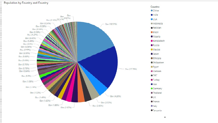
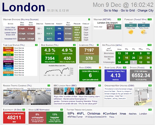
Here are some bad examples
This image has too many variables rendering it useless
This image has too much going on and is likely to confuse the consumer
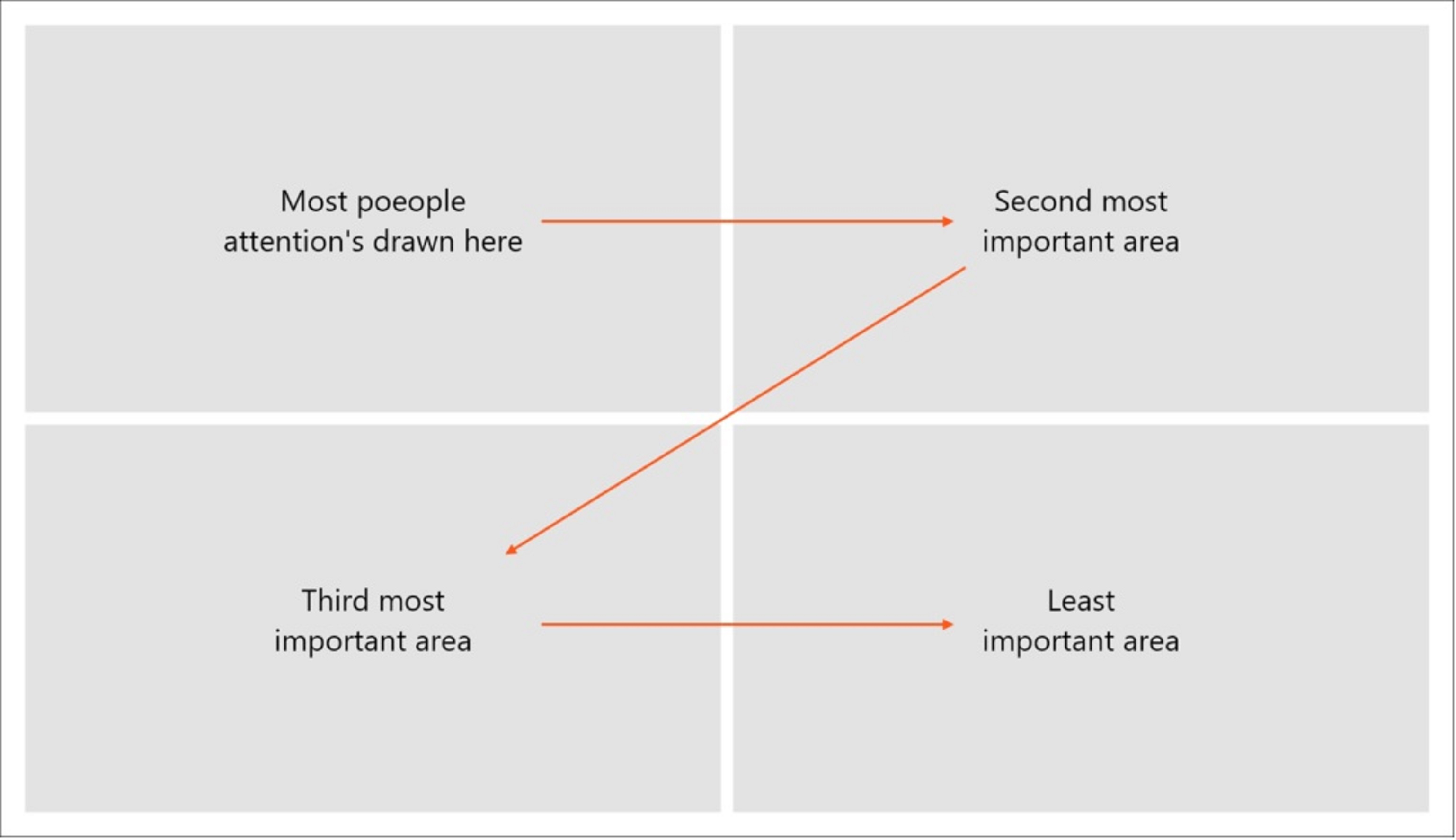
3. Follow the Z-pattern
Once you have identified your story and added key visuals. Present your visuals like a book. Do what is most natural to the human eye and place your visuals in a Z-pattern. The most important real estate on your report is in the top left corner, most reader’s eyes will land there first. Then, in order of importance, continue placing your visuals in a zig-zag pattern until finished. This will create a visual hierarchy helping the reader know what information is most important.
Conclusion
In summary, communicating with our bosses and co-workers through data visualization is vital for a successful career. While it may seem like a daunting task, these three tips will be incredibly useful in helping everyone around you to see the Elephant.